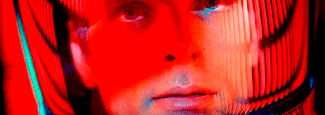
Color Theory at Cinema
The world around us is infused with colors, from the warm glow of dawn to the soft hues of dusk. Color theory is a discipline that seeks to understand how we perceive and experience this wonderful visual palette. From artists to scientists, color theory has intrigued creative and curious minds throughout history. In this article, we will explore color theory by explaining it through the lens of cinema. Surely, you’ve wondered more than once what makes a film visually appealing or why certain colors stand out more than others.
Color Theory
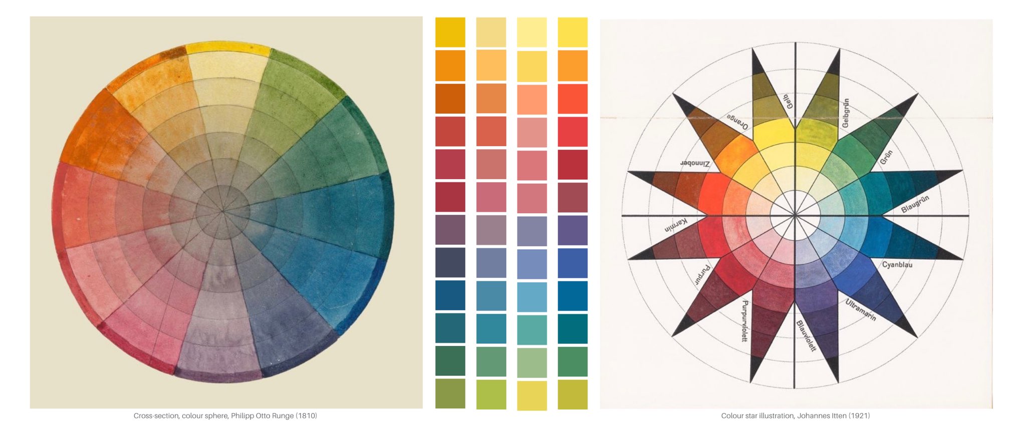
Color theory is a field of study that explores how we perceive and experience colors. At the heart of color theory is the color wheel, a visual representation of how colors relate to each other, organized in a circle, showing their relationships. Adjacent colors are called analogous, while opposite colors are called complementary. The primary colors, red, blue, and yellow, form the basis of all others. Mixing two primary colors gives rise to secondary colors (green, orange, and purple). This simple yet powerful tool helps understand chromatic relationships and create visually pleasing combinations.
Color Properties:
- Hue: The pure tone or color without the addition of white or black.
- Saturation: The intensity or purity of color. Vivid colors are highly saturated, while muted tones are less saturated.
- Brightness (or Value): The lightness or darkness of a color.
- Color Contrast: The difference between colors. High contrast can highlight elements, while low contrast creates harmony.
- Luminosity Contrast: The difference in brightness between two colors.
Psychology of Color:
- Warm Colors (Red, Orange, Yellow): Can evoke emotions like passion, energy, or happiness.
- Cool Colors (Blue, Green, Purple): Can convey calmness, tranquility, or mystery.
- Culture and Context: Color interpretation may vary based on culture and individual experiences.
Color Harmonies:
Complementary Colors: Opposite colors on the color wheel. Their combination can be vibrant and striking.
Analogous Colors: Colors close to each other on the color wheel. They provide harmony and are visually pleasing.
Triads and Tetradic Schemes: Combinations of three or four equidistant colors on the color wheel, respectively.


Color theory is not limited to our creations; it also manifests in nature. From the colorful display of a sunset to the rainbow after rain, the interaction of light with our environment creates amazing visual experiences.In summary, color theory is a fascinating field that spans science, art, and psychology. It helps us understand how we perceive and respond to colors, whether in a painting, a graphic design, or the nature that surrounds us. As we explore this rich palette of possibilities, we discover that color is not merely a visual phenomenon but a powerful tool that shapes our experiences and perceptions in astonishing ways.
In this case, cinema influences us consciously and unconsciously. Elements like art direction and color correction collaborate to build a visual universe with a specific palette connected to the film’s theme and intentions. Each color evokes various sensations in us, whether we are aware of it or not. This allows you to analyze your favorite films or apply it to your audiovisual projects.It’s essential to remember that, even though we are focusing on films, the psychological effects of these colors are not limited to cinema, as mentioned before; they extend to all visual arts throughout history, from painting to interior design and branding.
Color Associations and Feelings:
RED COLOR
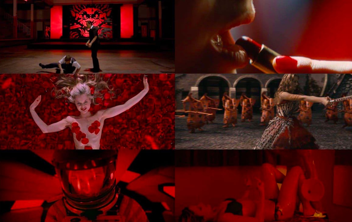
Historically associated with intense and uncontrollable sensations such as love, romantic passion, violence, danger, anger, or the ambition for power. This color is often present in stories that deal with forbidden, controversial, or sexual themes.

PINK COLOR
Traditionally linked to femininity, although this association has evolved over time. Pink suggests innocence, sweetness, playfulness, empathy, or beauty, being redefined by some contemporary filmmakers.
ORANGE COLOR
The color of dawn and dusk, combining sensations associated with a new day ( youth, friendship, warmth, sociability…) with elements related to memory or nostalgia. Generally, it is a cheerful and positive tone, evoking exotic and idyllic landscapes.


YELLOW COLOR
A contradictory color that, depending on the context, can represent madness, illness, insecurity, obsessions, but also idyllic and innocent. Wes Anderson uses it to combine seemingly innocent plots with problematica characters and feelings.
GREEN COLOR
Subject to context, green is quickly associated with nature but also with corruption, danger and the sinester. It’s no conincidence that many villains are associated with green, from Maleficient to Lord Voldemort.


BLUE COLOR
One of the most cerebral and rational color, commonly associated with calm and introspection, whether positive or negative. Traditionally linked to divine, probably due to its presence in skies and seas, it is also used in grand stories related to the meaning of life, as seen in ‘The Truman Show.’
PURPLE COLOR
Similar to blue but more related to fantastical or supernatural elements, purple and violet are used to explore ethereal and mystical themes. It is also linked to eroticism and mystery, combining the enigma of blue tones with the warmth and sexuality of other warmer tones.

We want to hear your opinion! How did you find this article on the theory of color applied to cinema? Did you find it interesting or useful? Is there any specific topic you would like us to address in our next post? Leave us your comments and share your ideas! 🎨🎬 #ColorTheory #ColorfulCinema
Related Posts
Pioneering Women in Logo Design
- piruv
- 13 de November de 2023
In terms of brand, a company’s logo is the cornerstone of its visual identity. At first g ..
The X-Height
- piruv
- 20 de November de 2023
Typography is an art that goes beyond written words; It is a visual expression that communicate ..
