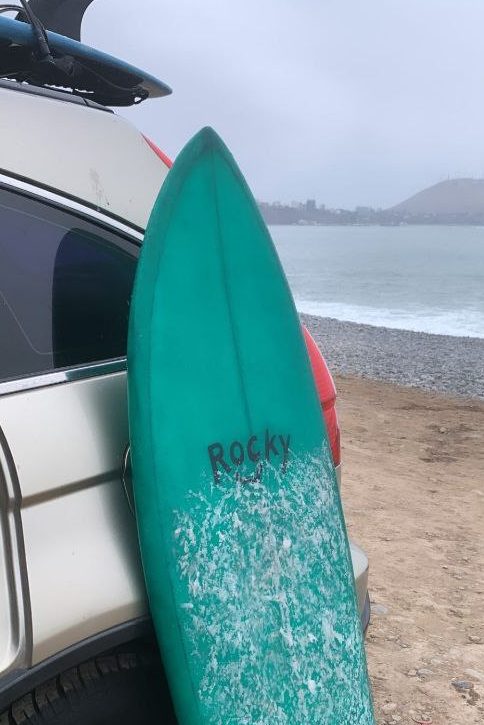
Before diving into the design, it is essential to understand the brand identity. “Rocky” is not just a company that makes surfboards and sells clothing; It is a lifestyle. It is the fusion of nature, quality craftsmanship and environmental responsibility. The brand is associated not only with the quality of its products and but also with its commitment and cooperation in the preservation of the ocean and marine life.
Inspiration from Nature and Surfing
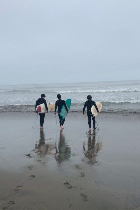
The process begins with the search for inspiration. In the case of “Rocky,” nature and the ocean are endless sources of ideas. The organic shapes of waves and the colors of the beach sunset become key elements. Surfing, as the brand’s central activity, is also reflected in fluid and dynamic lines. I also wanted to highlight the importance of the commitment to the environment as one of the brand’s values. Continuing with the values of transparency and closeness, I have represented them with the famous surfer greeting called “shaka.”
The Shaka greeting is so famous that it has become part of Hawaii’s identity. Although its origin is uncertain, many associate it with “aloha,” a famous Hawaiian word that means both “hello” and “goodbye” (also related to the concepts of love and affection). Additionally, “Shaka” is associated with phrases like “take it easy” or “excellent.
Be that as it may, the Shaka is the coolest and most relaxed greeting on the planet. It is a true symbol of having a good time, as it expresses joy, satisfaction and a sporty spirit. In fact, his experience is not only in surfing, but is also used in different areas of life, such as politics. Barack Obama, for example, used to greet in that way, since he was born in those lands.
Craftsmanship and Environmental Awareness in Colors and Shapes
Since “Rocky’s” surfboards are handmade, it is essential to incorporate elements that reflect craftsmanship, such as handmade typos. Simplicity in design is balanced with intricate details, providing a personal and authentic touch. Clean lines and smooth contours reflect the artisanal skill that sets “Rocky” apart in the market.
To convey the brand’s commitment to environmental protection, the choice of colors is crucial. Blues and greens evoke the ocean and nature, while graphic elements can represent life. Integrating symbols that evoke sustainability, such as earth shape, contributes to reinforce the environmental message.
The Final Result:
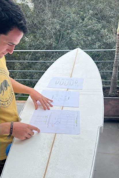
The process culminates in the creation of the “Rocky” logo. A design that is not just an image but a visual narrative telling the story of a brand passionate about surfing, committed to craftsmanship, and dedicated to preserving the beauty of the ocean.
“Rocky” doesn’t just have a logo; it has a visual identity that reflects its core values. Every line, color, and shape tells the story of a brand that seeks not only to stand out in the market but also to make a difference in the world, one wave at a time.
The project still keeps on, fell free to take a look


")


