Typography is an art that goes beyond written words; It is a visual expression that communicates not only through the meaning of the letters, but also through their shape and design. Among the many characteristics that define a typeface, the height of the ‘x’ is essential since it can influence the perception and readability of the text. In this article, we’ll talk about the ‘x’ in different fonts, looking at how this variable can shape the reading experience.
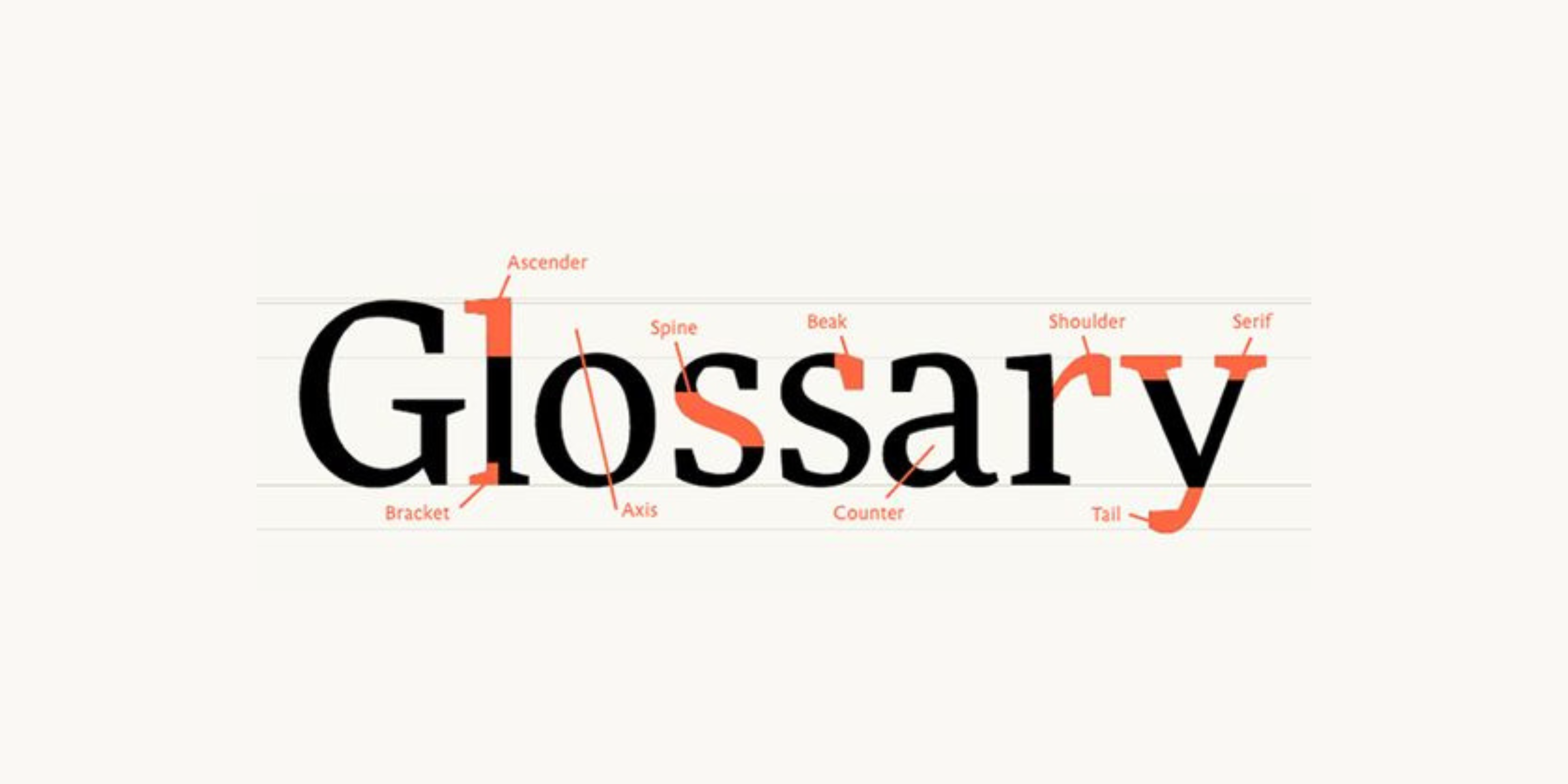
The height of the 'x' refers to the vertical distance between the baseline and the top of the lowercase letter 'x' in a specific font. This often overlooked measurement has a significant impact on the readability and aesthetic appearance of a text. Fonts with higher x-heights tend to have a more spaced-out, open appearance, while lower x-heights can give a denser, more compact appearance to text. The concept of "X-Height" in graphic design refers to the dimension of characters in a typeface, excluding considerations related to ascenders or descenders.
In other words, this term describes the elevation of lowercase letters, which do not include ascenders (such as 'd') or descenders (such as 'p'). A clear example of this height is the letter 'x,' from which the name originates. The X-Height measurement serves as a useful guide when designing a typeface.
Serif vs. Sans Serif:
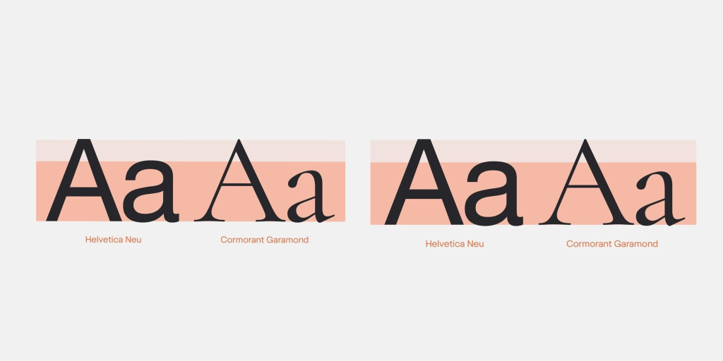
Serif and sans serif fonts, two fundamental categories, present notable differences in terms of the height of the ‘x’. Serifs, with their ornamental finials at the ends of letters, often exhibit lower ‘x’ heights. This can result in a more solid, classic look. On the other hand, sans serifs, known for their simplicity and cleanliness, tend to have higher ‘x’ heights, providing a more modern and airy look.
The height of the ‘x’ also interacts with the overall proportions of the typography, especially in terms of condensation, normalization and expansion. In condensed typefaces, where the letters are narrow, the ‘x’ is often raised to maintain legibility. In contrast, in expanded typefaces, the ‘x’ can descend to fill the extra space in a balanced way.
We want to hear your opinion! How did you find this article about typography? Did you find it interesting or useful? Is there any specific topic you would like us to address in our next post? Leave us your comments and share your ideas!